Behind the Image: A Monochrome Workflow
Over the past year I have begun thinking more thematically in my artistic process, approaching my images as collections and themes related to a larger idea or principle. How I came to that is a long story, but viewers of my comings and goings on Instagram or Facebook have probably noticed the shift.
That said, one of the projects I am currently working on is a collection I call “Winter’s Edge”. I had to step aside from progress on it for several weeks, but the latest addition to the collection unceremoniously called “#8” was a curious one. It threw some challenges my way and in sharing that creative process online I thought maybe some of you would be interested in seeing how I approached the image in both Adobe Lightroom and Adobe Photoshop. I tend to have a light hand in my post processing, but both tools are instrumental in producing nearly all of my images. There are multiple workflows to achieve a black and white or monochrome image like this, but this is the broad-stroke approach I took to produce this latest image.
Image Background
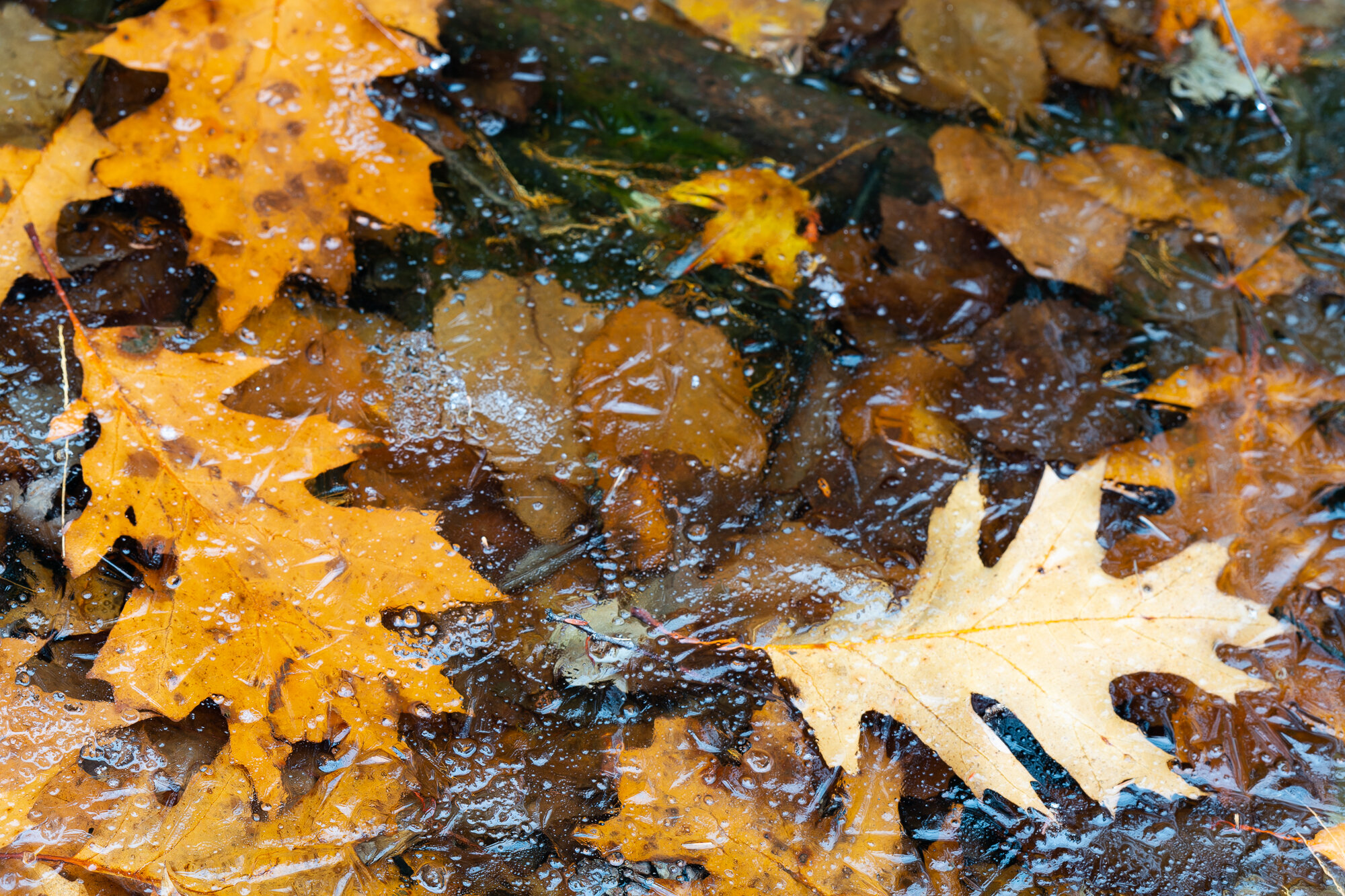
This black and white image is of fallen leaves trapped in the first ice of the season. It was taken in the morning on an overcast day near my home in Warren County, NY. I had to photograph the image from an angle because the ice was actually pretty thin. It definitely would not have supported my weight, but it did support the weight of the tripod with one leg on the ground, another on a log and the third on the ice surface. That said I had to shoot the image at an angle, so a focus stack of multiple images would be necessary for edge to edge sharpness.
Final version of “Winters Edge. Ed. 8”
Step 1: Prepare for stacking
This is the first image in the stack more or less straight out of camera. Before stacking I prefer to make several broad adjustments to all of the files in the stack. I do this on the first image and then sync to the rest in the stack. First, I removed chromatic aberration and applied lens profile correction in the Lightroom’s Lens Correction panel. No sharpness adjustments at this point. I then reduce highlights to tame any areas that were at risk of being blown out, because stacking can exacerbate those spots with a loss of data in the stacked image. Exposure, white balance, black point and shadows were then adjusted to mitigate clipping on both ends of the histogram. Then for proper color separation of the various spectra in the RAW image, I pumped up both saturation and vibrance to near nauseas levels. Don’t fret over that last step, it looks awful but that is important later for the B&W conversion to help you maintain control of the luminosity of the background colors beneath your monochrome image.

First image in the stack, straight out of camera.
First image in the stack, with global adjustments described above. Note the blue shift of the spectral highlights.
Step 2: Focus stacking
Since this image was shot at an angle with a moderate focal length of 130 mm at f9 at a distance of about five feet the depth of field for focus was around two inches. The subjects that I wanted in sharp focus in front of the lens were spread out over about fourteen inches. That said, focus stacking would be needed for what I wanted to achieve. My goal was as sharp of focus as I could get of the main oak leaf and surface ice structures from foreground to background.
Focus stacking is not possible in Adobe Lightroom and in Photoshop I often get mixed success with highly detailed or erratic structures. For these kinds of images I like to use Helicon Focus, but there are other options. I exported all sixteen images in the stack as TIFF files from Lightroom into their own folder. Opened up Helicon and pulled those files in. I’ll spare you on those details as that is a novel, but let’s just leave it at Helicon stacked the image flawlessly in just a couple minutes.
Close examination of the resulting image shows you loads of fine detail from the bottom to the top and from edge to edge.

Stack of 16 images prepared for stacking in Helicon Focus.
Step 3: Black and White Conversion
I next pulled the stacked image file into Lightroom and inspected it for any stacking issues. All was fine and so I began the black and white conversion. I converted it using Lightroom’s Black and White under the Basic Panel and then began making adjustments for black point, white point, overall exposure, tone curve and adjusted the color spectra in the HSL panel to dial in how I wanted the image represented. This is the aesthetic section, so it’s up to your vision for the image at this point.
I would point out at this step, however, that adjustments in the HSL panel can be overdone very quickly and introduce both noise and clipping very quickly. Less is often best here, but zoom in and see how it’s impacting the image. In this particular image the spectral highlights off the ice were globally tamed by pulling back the luminosity of the blue spectrum. Remember that saturation and vibrance step? It pays off right here. Look at the changes in the surface reflection off the ice and you’ll see what I mean.
Step 4: Transformations and Cropping
This image is admittedly a pretty chaotic one. One of the main issues is that compositionally it’s kind of upside down. There is a log in the upper middle as is and so I felt that that should be on the bottom as an anchor. I tried several orientations but literally flipping this vertically helped the best. I then had to transform the image in Lightroom to try to bring the focal plane under control. It wouldn’t make sense to your mind if the log was clearly further away from you in the final image than what was at top. Careful transformation helped to mitigate that focal confusion. Essentially, it’s twisting the image to make it appear as though it was more or less flat in front of your face.
Cropping is another long subject, but the photographic artist should be aware that proper cropping helps to create balance and flow in an image. As a 3:2 ratio out of the camera this image just was not working. As a 4:5 ratio, however, it was. In the very least it helped to create the overall flow I was trying to pull out of the image. You can now see that compositionally the image follows a golden spiral, a compositional balance that is often pleasing to the eye. Other fine adjustments like vignetting and tone curve were adjusted here, too.
Before and after example of how cropping and transformation can improve the overall strength of the image.
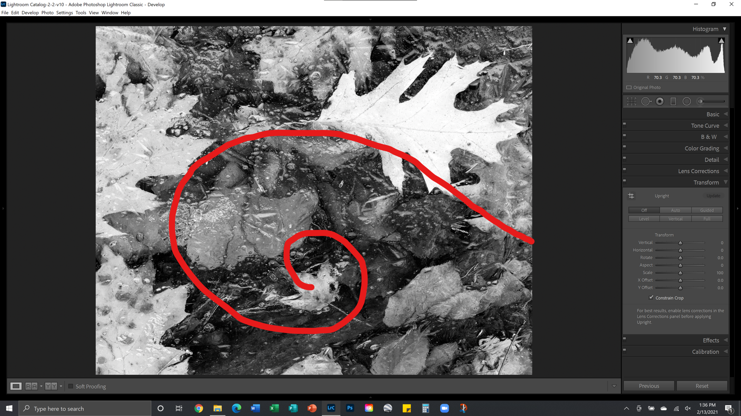
Golden spiral compositional element.
Step 5: Cleanup, Dodge, and Burn
Now that I had the composition and overall global adjustments dialed in I waited. Before moving any further I just hold out and make sure it’s ‘working’ and decide whether it needs any further global adjustments. I literally walk away and come back to it a few hours later or the next day. I then pull it into Photoshop and clean up any issues such as distracting elements or odd highlights that distract the eye. This could be something like an errant pine needle or stick. With ice, sometimes bubbles or snow on the surface can create a hot spot. Always check the corners and look at it under various magnifications.
After that cleanup process is complete, the bottom two layers in that Photoshop layer panel, next is the dodging and burning process. Again, I’m pretty light here stylistically. It is, none the less, an important step as it controls overall flow and the direction of the eye. For this image the main leaf was toned down as it was close to blowing out. The leaf at the center of the spiral was brought up as well as the tips of the oak leaf to the left. Three touch points of brightness across the spiral. Some light touches of brightness in the lower right leaves, too. All that dodging and burning occurred in three luminosity masks, the upper three layers visible in that layer panel. Save it as a PSD and bring it back into Lightroom.

Dodging and burning of specific leaves across the image to help direct the eye and minimize distractions in the image flow.
Step 6: Fine details
One of the issues I had with this image after the conversion to black and white was the intense amount of surface detail on the ice and how it was drowning out the details in some of the leaves. After some further thought I opted to dual process the image to reduce clarity and detail of the ice surface while exaggerating the fine detail in the main leaf. I wanted to pull out a difference between the two surfaces. There are multiple ways to achieve this effect, but what I opted to do was to create a virtual copy of the latest PSD file in Lightroom. One of them had reduced clarity and detail for the ice. The other had enhanced detail and clarity for the primary leaf. I pulled those two images back into Photoshop as layers and carefully blended the two using layer masks.

Note the large amount of surface detail on the ice.
Dual processing of the same image. Softened ice surface on the left, enhanced detail of the leaves at right. (click to expand.)

Opened in Photoshop as layers. Enhanced details on the upper layer (visible) which was then masked to hide everything but the leaves I wanted enhanced.

Zoomed way in, you can make out the softening of the ice combined with an enhanced texture of the leaf. The edges are not critical here as the viewer will not perceive the difference at the edge.
Step 7: Final proofing
The last critical step at this point is proofing. I often let it sit again at this point by walking away and coming back to it later. In this step what I like to do is come back to it with fresh eyes. More times than not, you will notice something you hadn’t before. I try it with a black background and a white background. How does the exposure seem? Is it balanced? Too bright, too dark? Are there any distracting elements that I missed? Zooming in too far can hide issues. Step back from it by reducing its size. Essentially, how is the forest looking? You can’t tell by focusing on the bark of one tree!

Compare at different magnifications against both white and black backgrounds.

Step 8: Rest
At this point several hours if not days or even weeks have passed. This is rarely a 30 minute thing, rather it’s a long and drawn out contemplative thing. It should be a thoughtful, enjoyable process. Not a rush job to meet some peak in social media traffic or feeding some inconsequential algorithm. Take time with your work and enjoy it, let it reflect you rather than just a portion of you.

RAW image before ant processing.

Final image, “Winter’s Edge. Ed. 8.”
Thank You!
Thank you so much for your interest. Feel free to comment below if you have any questions about my work here. The entire collection can be seen in my recent work collection on the website. I hope this was helpful to some of you.
Cheers and good health.
-- James Rodewald